Choosing a colour palette for your bespoke kitchen is one of the most important choices you will make. The perfect colours help create an ambient space that you will love to spend time in. The right contrasts and complementary tones can ensure that your bespoke kitchen is the beautiful space that you envisaged.
Here are some of our favourite colour trends influenced by the Pantone Spring/Summer palette which we feel will make a wonderful kitchen.
A mid-coffee brown (18-1307 Coffee Quartz)
Elegant and luxurious, this rich brown tone is the perfect contrast against cream. It looks stunning with a quartz worktop. Your kitchen units will pop with the warm brown creating an inviting space where you will love to spend time.
Palest grey (11-1001 White Alyssum)
White Alyssum is absolutely stunning in its simplicity. It is an ideal choice for a fresh clean kitchen. This pale grey is less stark than pure white, but just as impressive. Grey is a fabulous base colour, contrasting with darker greys, blues or even wood. A wooden worktop will finish the look with a luxurious feel. Alternatively, for an uber-modern kitchen a dark quartz worktop in deepest grey or black creates a striking look.
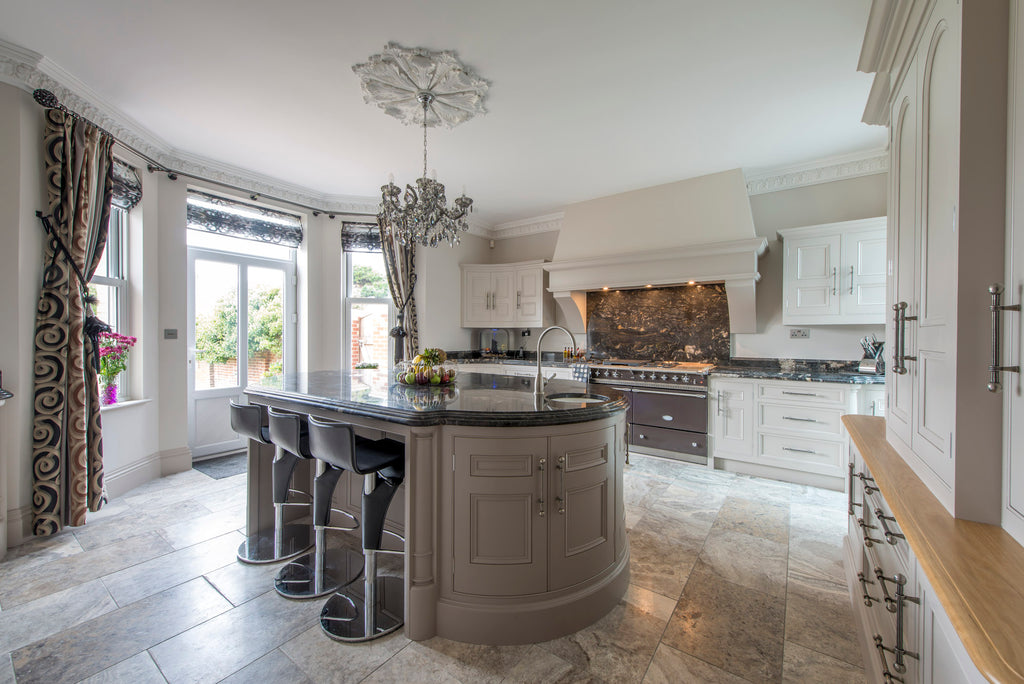
Mushroom beige (15-1304 Humus)
A beautiful colour, with a nod to both nature and neutrality, is a pale beige tone. Creating a calm, relaxing ambience in a bespoke kitchen, a neutral beige is anything but bland. The kitchen units look stunning in a beautiful mushroom colour.
Sage green (15-6316 Fair Green)
Sage green kitchens are here to stay. Green is a classic kitchen colour and sage green, with its muted tone, screams elegance. The green tones are perfectly paired with wood for a country kitchen feel. Cream is a beautiful contrast creating a natural homely kitchen everyone feels welcome in.
Ocean blues (14-5713 Cascade)
Blues have been a popular kitchen colour choice, so it comes as no surprise this colour is featured on the Pantone Spring/Summer 2022 list. However, there is a slight update on the tone of blue, one that we think will look fabulous in a bespoke kitchen. The slight move towards an ocean blue brings an air of fun and freshness. Bright, without being overwhelming, an ocean blue tone creates a clean calming kitchen.
Pastel pink (13-2004 Potpourri)
For the more adventurous, a beautiful pastel pink looks gorgeous. Not a traditional kitchen colour, but one we feel in the right space will create an amazing bespoke kitchen. A dusty rose pink is a fantastic colour and, coupled with grey, creates an air of sophistication.
For more information about Bryan Turner Kitchen Furniture and accessories, give us a call at 01953 660762 and speak to a member of our expert team today or Email us at enquiries@bryanturnerkitchens.com. We look forward to hearing from you.
